contributors
Since 5.12.0, Ant Design 5.x enabled CSS variables again. Unlike 4.x, this time we have integrated the capabilities of CSS-in-JS, and all Design Tokens have been included in the management scope of CSS variables.
Since 6.0.0, CSS variable mode has become the default mode.
CSS variable mode brings two important improvements to Ant Design's styling capabilities:
CSS variable mode requires a unique key for each theme to ensure style isolation. In React 18, we use useId to generate unique keys by default, so you don't have to worry about this issue in React 18. But in React 17 or 16, you need to manually set a unique key for each theme, otherwise the themes will be mixed up.
// React 17 or 16<ConfigProvider theme={{ cssVar: { key: 'app' } }}><App /></ConfigProvider>
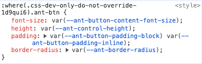
You can see that some specific values in the antd component styles have been replaced with CSS variables:
Hash is one of the features since Ant Design 5.0. Its function is to calculate a unique hash value for each theme, and use it in the class of the component to isolate the theme style.
However, after enabling CSS variables, the component styles of the same antd version will not change with the token —— because we use CSS variables to fill in the dynamic parts of the styles. So if there is only one version of antd in your application, you can choose to disable hash to further reduce the total size of the styles:
<ConfigProvider theme={{ cssVar: true, hashed: false }}><App /></ConfigProvider>
Since 6.0.0, we provide the zeroRuntime mode to further improve application performance. After enabling it, Ant Design will no longer generate component styles at runtime, so you need to import the style files yourself.
import 'antd/dist/antd.css';export default () => (<ConfigProvider theme={{ zeroRuntime: true }}><App /></ConfigProvider>);
antd/dist/antd.css is the compiled style file of all components. If you want to reduce the size of the styles, or you have modified prefix that cannot use the default styles, it is recommended to use @ant-design/static-style-extract.
import fs from 'fs';import { extractStyle } from '@ant-design/static-style-extract';const cssText = extractStyle({includes: ['Button'], // Only include style of Button});fs.writeFileSync('/path/to/somewhere', cssText);
With CSS variable mode, the method of modifying the theme is the same as before, refer to Customize Theme.
cssVar configuration:
| Properties | Description | Type | Default | Version |
|---|---|---|---|---|
| prefix | Prefix of CSS Variables, same as prefixCls of ConfigProvider by default | string | ant | 5.12.0 |
| key | The unique key of theme. Automatically set by useId in React 18, but need to be set manually in React 17 or 16 | string | useId in React 18 | 5.12.0 |